

I have been designing web pages for more then 5 years, and can design professional websites. The art of web page creation is not only the pure design and scripting, but also to make effective pages that is satisfying also on low bandwidths. It is important to know the different formats you can use, and how they are compressed and work. Anyone can create a good looking web site, but a successful web designer will have to know how to make them download fast as well as being good looking in many different resolutions and browsers.
| www.bewi.no: BeWi is a company producing packaging for food and technical goods, as well as isolation for houses. Earlier they produced expanded polyester for these products, but has now gone over to EPS which is a more environment friendly material. This website needed to signal both that they are a technologically advanced company as well as environmentally conscious and friendly.
|
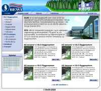 |
To highlight the technological aspect I wanted to make subtle associations towards a technical drawing, as well as metallic shiny surfaces of machinery. The background pattern to this site is a grey on white grid to lead our thoughts towards a technological drawing or blueprint. The boxes containing information to the left on the site (as the news box below the submenu) is designed to bare resemblance with a simple LCD screen, which combined with the shiny hard surfaces gives associations towards mobile telephones, PDA's and such technological applications. The menu line is designed to bare resemblance with a metal tube bringing connotations about industrial technology with it, which is also an aspect for the desired representation of BeWi. The environmental aspects is taken care of in a less subtle way with the header being a window into a nature scene, where the house symbolises the humans intervention in nature living along side nature in harmony. Also helping along with these associations is the company logo which contains quite organic shapes, which I have therefore attempted to wove into the more hard shapes of the technological designs in the page. Even though the connotations are fairly exposed in this bit, the link between the two happens on a much more subtle level. Hopefully so subtle an audience wont even realise these signals being there, but still draw the desired conclusions about the company. |
|
| www.berny.no: Berny is a company renting out and selling circus tents and various tent solutions for different arrangements. This webpage serves both for selling tent solutions as well as giving background information on the company. There was no need for many topics here, so I settled for not categorising the pages and instead use the submenu space for tent advertisements. |
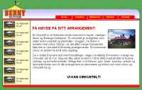 |
| This way the various tents will always
be in the frame, keeping the customer always aware of the offers
while surfing the pages. On this website associations has to go towards both circus, party and fun as well as a serious reliable business. The colour scheme I chose therefore representing all 4 pigment colours (red, green, blue and yellow), to give this colourful and almost childlike atmosphere. Red frames the site content being represented both in the “roof” and the “floor” of the page. This is why I’ve chosen this strong and clear shade of red standing out from the rest. Naturally yellow compliments red, therefore becoming the second most used colour on the site (as also seen in the logo). The header is given a light sky blue which gradients towards white, bringing associations towards a cloud free sky on a sunny day. This way how the menu overlaps the header brings further subtle associations to it as the tent roof, making the two red lines framing the content seem even more like a tent on its own. The shapes used in this website is mostly rounded and soft, including highlights and shadows to create a 3D effect leading us towards connotations of shiny colourful candy. Animating the tent in the logo gives a source for motion in the page thereby demanding attention, and give an immediate association towards tents which is also the main aspect of the whole company. The background is also leading our thoughts towards tents as the pattern seems woven as a tent canvas, and given the pigment colour green complimenting the colour scheme of the page itself. |
|
| www.medialab.no: Medialab companies main activity is to produce infomercial and commercial videos, but does also offer other services like arranging big screen presentations and producing DVDs, CD-ROMs, brochures, posters etc. When starting on this project I wanted to use a colour scheme deriving from the 3 base light colours (red, green, blue), as video is Medialabs main production. |
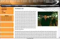 |
| But as the production can be divided into 3 categories,
also basic information and references and the obligatory contact
page has to be included, making 6 main segments the page will have
to contain. I decided therefore to colour code the segments of the
site using the 6 secondary pigment colours. The menu line has to stand out from the page so I made that into a black 3D bar. The black colour mainly to create subtle associations to controls on a VCR, trying to make the bar look like shiny dark plastic or glass with a black background. The buttons emulating the button on a VCR lighting up when pushed, using the 6 pigment secondary pigment colours for the division between the main segments. Also a part of the work done at Medialab is a lot of leads pulled over long distances for multi-camera productions and big screen arrangements, so I created a not too evident connotation of this using the curving lines down to the “VCR-control” menu and further down to the page itself. This way you could say you control the website through these leads leading from the menu line resembling a control panel. The shapes are for the most part rounded to resemble the rounded edges on a television screen. The rounded rectangles below the submenu can be used for advertisement space and does also lead associations towards a filmstrip. The strip of rounded rectangles slowly moving from right to left at the top, bares a bit more evident resemblance of a filmstrip moving across the header also giving source for motion and capturing the attention at Medialabs main production - moving images. When the buttons on the menu line are clicked the name of the segment coming up is flashing in various fonts and sizes over the filmstrip, creating connotations towards film and the flashing shapes and editors notes you often see in the beginning of a roll of film. |
|
The parts of webpage design I still learning about is
the so called database formats (asp and php), but I have not yet needed
these features for my web pages. The pages you are looking at now is
of course designed by me, and the HTML is mostly written in notepad
and I have also used the necessary applications for flash, shockwave
and 3D using the facilities on University of Sunderland. As you can
see I can use basic HTML and CSS, some JavaScript as well as being fairly
literate in Lingo and actionscript. Some I have learned on the university,
and some I have taught myself.